User interaction
A user step contains a sequence of interaction items, such as input controls, lists, and static texts. Each type of interaction item has several properties and preferences. Read more about the controls here.
Multi exits
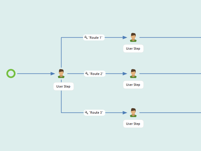
A user step can feature multiple exits, which appear as buttons in the client interface. There's no limit on the number of exits possible, but having too many buttons (especially in mobile clients) can clutter the interface. In such cases, using a sub-workflow instead of a exit button may be preferable.

Default exit
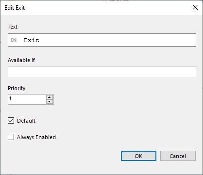
If a user step has only one exit, it's automatically set as the default. However, when there are multiple exits, you must manually designate one as the default. The default exit is utilized when the exit buttons are triggered not by clicking direcklt on them in the interface but by pressing Enter on a keyboard or when using a scanner.
Click to open the exit step and check Default.

Priority
The priority determines the order in which the exit buttons are displayed in the client interface.
Always enabled exit
Check the Always Enabled box if an exit should always be available regardless of other conditions.
If data is partially entered in the user step from which an always enabled exit is used, the data is not cleared but can be utilized later in the application. Designers should exercise caution when using always enabled exits to ensure that the next step is not dependent on data from the exited step.
Pinned user steps
A pinned user step serves as an information step.
In pinned user steps, only non-editable controls can be used. This limitation exists because a pinned user step is solely intended for displaying information to the user, not to change it.
The pinned user step will appear on the side or top of the screen, depending on the client you are using. Click on the pinned step to open it, and click again to close it. The pinned step becomes available when the user passes the step in the application process.


User step designer
The designer enables drag-and-drop interaction with the user step. Users can easily drag controls from the left side and drop them inside the design area. The designer supports adding 1, 2, 3, or 4 columns in one row, but only certain controls are allowed to be placed side by side.

User step settings
Auto Forward
The option to configure the workflow for automatic progression to the next user step is enabled by the Auto Forward configuration.
Enable: Activate the auto-forward feature by checking the "Enabled" checkbox.
Delay: Define the waiting time before the app advances automatically using the "Delay" setting. Options include Instant, 1 second, 2 seconds, and 4 seconds.
Condition: Add a condition to determine when the auto-forward action should occur. Note that it considers variable values when entering the user step, not changes made within the user step itself.
Use auto-forward in combination with Default and Always enabled Exits to maximize flexibility.
Prevent going back
The prevent going back configuration is to set if it should be an option or not for a client user to Undo and go back to the previous user step.
If checked the Undo option will not be available, if checked it will be visible unless the workflow just passed a committing step.
Note that Prevent going back can be set on the individual user steps or for the whole workflow, including fragments, in Workflow - Runtime options - Prevent Go Back.
Allow dependencies
Allow dependencies enables controls to depend on each other. Dependencies can be used, for example, to filter data in the data source or to hide controls using condition to hide.
See examples of how it can be used here.
Reloading
User steps with incoming data arrows can be reloaded, if the "Allow reloading" checkbox in the User step dialog is checked. The Allow reloading option is on as default.
Reload is done by swiping down, coming back to the user step from a sub-task, and by timer. Note that if an event step timer is used, it will reload the user step regardless of Allow Reloading being true or false.
Reloading rules
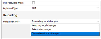
The reloading rules are configured in Merge behavior:
Keep my local changes
Take their changes
Discard my local changes

Merging rules per control

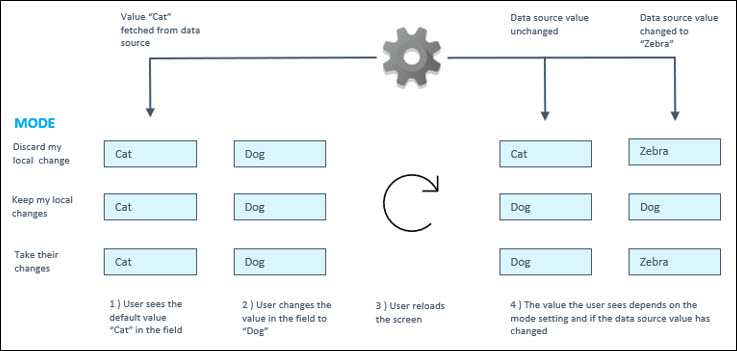
Text input, Numeric input, Time picker, Date picker, Checkbox, Menu selection and Binary Option input: For these controls, we have three options: Keep their changes, Keep my local changes, Discard my local changes.
For Keep their changes:
If we reload and the default value has changed, the new default value is used.
If we reload and the default value has not changed, the value typed by the user is used
For Keep my local changes:
If we reload and the user has changed the value, the user's value is used no matter what the new default value is.
If we reload and the user has NOT changed the value, then the new default value is used.
For Discard my local changes:
Whatever the user has typed, it is not kept when reloading.
Grid, Calendar: There are two options: Keep my local changes, and Discard my local changes. There is also the option of specifying a Unique ID column, which is used to identify rows when merging changes after reloading.
For Keep my local changes:
If a Unique ID column is set, deleted rows are still deleted after reload
If a Unique ID column is set, selected rows are still selected after reload
If a Unique ID column is set, edited cells keep their value IF the column has "Keep my local changes" set
Added rows are added back (no Unique ID column needed for this)
For Discard my local changes:
Selection, additions, deletion and cell edits are reverted when reloading.
List selection, list multi-selection and image selection:
For Keep my local changes:
Selected items are re-selected after reload, if possible.
For list selection and multi-selection, rows are identified by group text, large text and small text, if all three are the same, the row can be re-selected
For image selection, the image URL is used to identify rows for re-selection.
File gallery and camera input:
For Keep my local changes:
Added files/pictures are kept after reload
For Discard my local changes:
Added files/pictures are removed after reload
For signature input:
For Keep my local changes:
Added signature is kept after reload
For Discard my local changes:
Added signature is removed after reload
External app launcher:
For Keep my local changes:
The state is restored if the launcher has been run For Discard my local changes:
The state is reset so that the launcher can be used again.
Verb subtask:
The state is reset when reloading
Checklist subtask: A unique ID column has to be set up for merging to work.
For Keep my local changes:
Checked items are still checked (based on the Unique ID column) when reloading For Discard my local changes:
Checked items are reset when reloading.
Item creation subtask:
For Keep my local changes:
Added items are still added
For Discard my local changes:
Added items are removed when reloading.
Last updated
Was this helpful?